
Omnibus Rebind: Vicious Lost Boys (The Never King)

Updated: Oct 7
This is the series that made me quit book binding for over a year. Just gonna leave that there.
I'm going to start by saying if you're reading this series with me, you're probably not here for the plot. No judgment here! Neither was I.
Vicious Lost Boys by Nikki St. Crowe is definitely a guilty pleasure series. Is it one I'd enthusiastically recommend at my next dinner party? Probably not. Like I said, guilty. We can keep it hush-hush. My mom definitely doesn't need to know.
That said, I loved this series! Like I said, guilty pleasure, and I, for one, am guilty as charged.
The series is a dark, smutty reimagining of Peter Pan, following a descendant of Wendy Darling who is kidnapped by a much more vicious version of Peter Pan and his Lost Boys, and slowly becomes part of their world.
The first four books in the series, The Never King, The Dark One, Their Vicious Darling, and The Fae Princes, were gifted to me for my birthday in 2023, and individually, they're all relatively small books. And the cover art on them is and always was eye-catching and BEAUTIFUL!
There was just one problem. They didn't match.
Three of the books were clearly printed in the same place, but the fourth had completely different paper. Different color. Different texture. Even the physical size of the book was slightly different (yes, it's only a few millimeters, but it was enough to bother the heck out of me).
And apparently that bothered me enough that the only reasonable solution was to rip the covers off all four books and turn them into one enormous 889-page omnibus.
As one does.
Making Four Books Into One
This was my first attempt at an omnibus rebind, and the basic idea seemed simple enough: remove the original paperback covers, glue all four text blocks together, trim everything down to the same size, and turn them into one cohesive book.
Simple, right? Famous last words. This project began in May of 2024. I finished it in November of 2025. So perhaps "simple" wasn't the word we were looking for.

After removing the original covers, I glued the four text blocks together with PVA and left the entire thing in my press for a couple of days. Once I was confident I had one solid text block, I put it through my guillotine to trim everything to the same dimensions.
Considering the mismatched sizes were one of the things that bothered me enough to start this project in the first place, that part was extremely satisfying. Too satisfying. I blame this moment as the moment I got overly confident, the moment I thought it was all going so well.
Once trimmed. I reinforced the combined spine with mull before casing it in, which is something I try to do with essentially every book I make, and especially with an 889-page monster made out of four previously independent books, a little extra structural support seemed like a good idea.
First of Many Fails: Edges Gone Wrong
Now we arrive at the reason this book spent approximately a year haunting me. The edges.
Remember that fourth book with the completely different paper? Even after trimming everything to the same dimensions, you could still very clearly see the difference between the paper coloring along the fore edge. Covering the edges seemed like a quick solution, and boy, was I wrong.
My first idea was foil. It did not work. More specifically, it worked on three books. Guess which one it didn't work on?
After a lot of frustration and several attempts to convince the fourth book to cooperate, I finally admitted defeat, sanded everything down, and started over.
Attempt number two: spray paint. Also unsuccessful. Once again, that fourth text block apparently decided that accepting pigment was beneath it. Not only that, but I found the result to be subpar. The pages were sticking together, and my attempts at cracking the casts resulted in the spray paint flaking in many areas, leaving a disappointing grey in some areas and a chunky black with the texture of tubing mascara in others.
Back to the drawing board. Again.
Finally, on attempt number three, I airbrushed black acrylic. I ended up lightly sanding the bigger chunks of spray paint off and painting right over, hence the inconsistent sand lines. (I'm sorry; I was over it, and this is the best I could bring myself to do.) Then I went to Harbor Freight to pick up an airbrush I definitely did not need in my crafting collection. Was it absolutely perfect? No. Was it significantly better than where we started? Yes.
At a certain point in any project, you have to decide whether you're striving for improvement or slowly descending into madness. I chose improvement. Eventually. The final result still has some bare spots on that fourth book, and even after airbrushing, chunks of the prior spray paint continued to flake off, but if we're being honest, I couldn't sand it down any more without compromising the text and was at wits' end, so it was time to leave well enough alone.

Designing the Case: Black on Black on Black
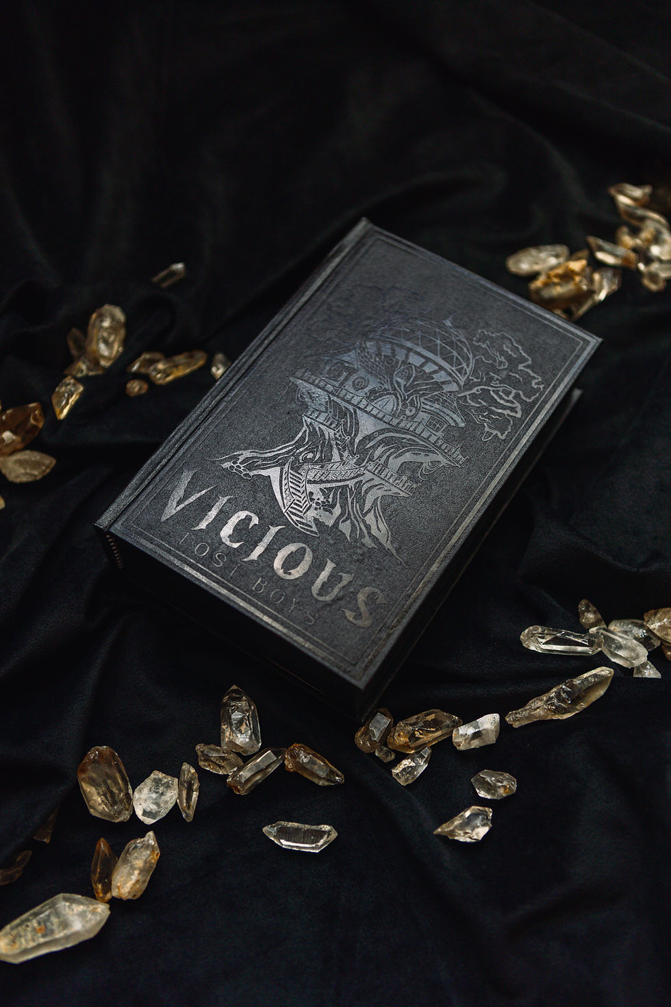
From the beginning, one thing I knew about this book was that I wanted it to be DARK. The darkness fits the overall atmosphere of the series, but I also really liked the idea of creating a book where the design didn't immediately jump out at you. Instead, the black HTV catches the light differently against the black faux leather, allowing the design to emerge from the cover.

Black cover. Black design. Black edges.
Black on black on black.
For the front, I created a treehouse with a glass geodesic dome incorporated into the design. The treehouse is a nod to where the characters live, while the dome references the stargazing elements of the books.
I liked the geodesic shape in particular because it reminded me of the architecture you might see at a planetarium or another place designed specifically for looking up at the stars. It seemed extravagant enough to be designed by Pan himself. And because apparently I am physically incapable of designing something uncomplicated, I made the whole thing far too intricate. Again. There was a lot of weeding (though not enough to add it to my fails list). But I'm glad I committed to it, because the finished design turned out exactly how I wanted, beyond the fact that I overheated the HTV and definitely got some melty seepage in the process.

On the back, I used the quote:
"Start running, little darling. And don't look back."
It felt like one of those lines that encapsulated the entire series regardless of which character actually spoke this line.
Problem Two: Case Bubbling Faux Leather Finish
This was also my first time using this particular faux leather from Hollanders for a full bind, and I was very impressed!
It's extremely thin and malleable, so despite having a really nice leather-like sheen, it doesn't feel like you're trying to wrestle a thick piece of leather around your book boards. It glued beautifully, wrapped easily, and I would absolutely use it again.
My one complaint is bubbling. I ended up with more visible bubbles underneath the finished cover than I normally get when I'm working with a more canvas-like bookcloth, and the sheen of it really allows you to see all imperfections. In that way, this material was a little less forgiving than my normal book cloth. The imperfections are noticeable if you're looking for them, but not enough to outweigh how much I liked everything else about the material. Definitely something I'll use again—just with a little more care next time.
Issue Three: Some Things Don't Match

Because apparently this book hadn't fought me enough, I discovered one more minor problem when I reached the headbands. I didn't have solid black. I didn't want to spend the time or money on getting the right ones, and wasn't feeling patient enough to make them myself after all of the previous disasters, so the one deliberate break in my otherwise black-on-black-on-black book is a set of black-and-white checkered headbands, which I actually don't mind. They are hidden enough to not really matter.
For the endpapers, I used a dark blue and grey cardstock with silver constellations that I got from Michaels. They bring back the stargazing theme from the front cover and add a little bit of shine when you open an otherwise very dark book. It's subtle, but it ties the whole design together in a way I really love.
Side Quest: Bookmark Project
One of my favorite parts of this project actually has nothing to do with the finished omnibus.
Whenever I make a book, I save the leftover pieces of my endpapers and turn them into bookmarks. Bookbinding can create a surprising amount of waste, and if I have perfectly good decorative paper sitting around, I'd rather turn it into something useful than throw it away.
You might have received some of my repurposed scraps over the years in the form of bookmarks! I try to add one into every binding tool order I receive – my way of sharing a bit of my recent binds with others while upcycling.
With this project, though, I had something else sitting around. I was left with the four original paperback covers, which had some pretty dang cool art on them. The covers of these books are actually what made me want to read them to begin with. That, and my love of morally grey male leads who are slightly unhinged.
It seemed a shame to simply throw away one of the most recognizable pieces of the original books, so I turned the covers into bookmarks. Each front cover featured a face. I cut each face in half vertically, leaving part of the title visible, and preserved the pieces using adhesive laminating sheets. Four covers became eight bookmarks, each showing half of the original artwork.

I really love that they let me carry a little piece of the original books forward into the finished project. The paperbacks themselves don't exist anymore, but they aren't completely gone either.
And now the new book comes with a ton of bookmarks to choose from, which, considering the size of this thing, might all come in handy.
This is definitely a trick I plan on continuing with future rebinds if the cover is salvageable.
The Final Mistake... About That Fifth Book...
Well, it's almost a year later, and here's the part where we all laugh at me if you haven't been already. When I made this omnibus, I believed I was combining the entire series. Yes, the fourth book ended with a baby cliffhanger, one I expected to be addressed in the heavily hinted-at spin-off series for other characters in the story that I will not spoil.
Four books. One omnibus. Done. I finished my omnibus well over a year after I finished reading this series. When I closed book four, I moved on with my life, any unresolved plot forgotten. Then, a few weeks ago, in August 2026, I walked into Barnes & Noble and discovered Vicious Lost Boys has a fifth book: The Never Queen.
Holy facepalm. I had absolutely no idea. Had I known at the beginning of this project, I definitely would have waited and included it. There is a part of me that will now forever know my omnibus is technically one book short. Am I going to rip apart a project that took me over a year to finish so I can add it? Probably not, and that's okay. It's probably important to continue to humble myself with the knowledge that the perfect bind does not exist.
And honestly, at this point, I don't even know if I'm going to go back and read the fifth book. I loved the series, and yes, that decision might be out of spite, but it is what it is. I would have loved to know about the fifth one before gluing the first four together, but when I started this project, it simply did not exist.
Hindsight is 20/20 and all that jazz.
The Finished Omnibus

This project frustrated me more than most. Enough that I took a pretty notable break from binding there. It broke my spirit and the delicate confidence I've built surrounding this craft, and I needed to walk away for a while to lick my wounds.
I started it in May of 2024 and didn't finish until well over a year later, not because it actually required a year of work, but because every time something went wrong, I became a little more hesitant to touch it again. It made me scared of all of my binds. Countless projects went unfinished, scared of disappointing myself and anyone who might stumble across my binds.
There was always this feeling of, Okay, what is going to go wrong next? The edges alone went through foil, sanding, spray paint, more sanding, and finally acrylic airbrushing before I got them somewhere I was willing to accept, which still wasn't what I wanted.
All things considered, looking at the finished book now, I'm proud of it. Begrudgingly so, but still proud of it.
Four mismatched little paperbacks became one cohesive, almost entirely black behemoth. I got to experiment with a new cover material, try an omnibus construction for the first time, figure out an edge treatment through a truly unnecessary amount of trial and error, and even find a way to preserve pieces of the original books instead of throwing them away.
A lot of lessons were learned, and plenty of ideas for next time have been conceived. I'm glad I finally broke my book-binding break and got back out there to finish this thing. I hope never to go that long between binds again.
Thank you for checking out this chaotic rebind! If you are interested, follow me on Instagram for updates on what I am working on, and check out my other fanfic binds and rebinds!
Happy Reading!
– The Binder's Room
Reminders:
Fanfic Binds are for my personal use only and are not available for commission.
Books are all lawfully purchased prior to rebinding.
I do not own the rights to the material between the covers; I just make the covers.
None of the content inside the books has been changed.
Commissions are only offered for Rebinds and Original Works.

Comments